 易网时代-编程资源站
易网时代-编程资源站
易网时代-编程资源站 <shape><!-- 实心 --><solid android:color="#ff9d77"/><!-- 渐变 --><gradientandroid:startColor="#ff8c00"android:endColor="#FFFFFF"android:angle="270" /><!-- 描边 --><strokeandroid:width="2dp"android:color="#dcdcdc" /><!-- 圆角 --><cornersandroid:radius="2dp" /><paddingandroid:left="10dp"android:top="10dp"android:right="10dp"android:bottom="10dp" /></shape>solid:实心,就是填充的意思
<corners android:topRightRadius="20dp" 右上角android:bottomLeftRadius="20dp" 左下角android:topLeftRadius="1dp" 左上角android:bottomRightRadius="0dp" 右下角/>这里有个地方需要注意,bottomLeftRadius是右下角,而不是左下角,这个有点郁闷,不过不影响使用,记得别搞错了就行。
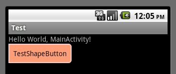
<Buttonandroid:layout_width="wrap_content"android:layout_height="wrap_content"android:text="TestShapeButton"android:background="@drawable/button_selector"/>button_selector.xml:<?xml version="1.0" encoding="utf-8"?><selectorxmlns:android="http://schemas.android.com/apk/res/android"><item android:state_pressed="true" ><shape><!-- 渐变 --><gradientandroid:startColor="#ff8c00"android:endColor="#FFFFFF"android:type="radial"android:gradientRadius="50" /><!-- 描边 --><strokeandroid:width="2dp"android:color="#dcdcdc"android:dashWidth="5dp" android:dashGap="3dp" /><!-- 圆角 --><cornersandroid:radius="2dp" /><paddingandroid:left="10dp"android:top="10dp"android:right="10dp"android:bottom="10dp" /></shape></item><item android:state_focused="true" ><shape><gradientandroid:startColor="#ffc2b7"android:endColor="#ffc2b7"android:angle="270" /><strokeandroid:width="2dp"android:color="#dcdcdc" /><cornersandroid:radius="2dp" /><paddingandroid:left="10dp"android:top="10dp"android:right="10dp"android:bottom="10dp" /></shape></item><item> <shape><solid android:color="#ff9d77"/><strokeandroid:width="2dp"android:color="#fad3cf" /><corners android:topRightRadius="5dp"android:bottomLeftRadius="5dp"android:topLeftRadius="0dp"android:bottomRightRadius="0dp"/><paddingandroid:left="10dp"android:top="10dp"android:right="10dp"android:bottom="10dp" /></shape></item></selector>运行效果如下图:
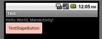
获得焦点状态:
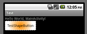
按下状态:
以上所述是小编给大家分享的Android中shape定义控件的使用,希望大家喜欢。