 易网时代-编程资源站
易网时代-编程资源站
易网时代-编程资源站 <meta name="viewport" content="width=device-width, initial-scale=1.0, maximum-scale=1.0, user-scalable=no">可是这段代码我不能用。因为我的页面是做了适配的。可以根据屏幕的大小来显示字号和样式的大小。如果我加了这段代码的话,我的适配就不能用了。所以要用其他方法
// Listen for orientation changeswindow.addEventListener("orientationchange", function() {// Announce the new orientation numberalert(window.orientation);}, false);只要用户改变了设备的查看模式,就会触发 orientationChange事件。此时的event对象不包含任何有价值的信息,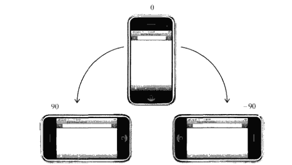
因此,结合这个orientationChange事件和window的orientation属性,我们就比较好判断设备是处于横屏还是竖屏了
(function(){var init = function(){var updateOrientation = function(){var orientation = window.orientation;switch(orientation){case 90:case -90:orientation = "landscape"; //这里是横屏break;default:orientation = "portrait"; //这里是竖屏break;}//html根据不同的旋转状态,加上不同的class,横屏加上landscape,竖屏//加上portraitdocument.body.parentNode.setAttribute("class",orientation);};// 每次旋转,调用这个事件。window.addEventListener("orientationchange",updateOrientation,false);// 事件的初始化updateOrientation();};window.addEventListener("DOMContentLoaded",init,false);})();因此可以根据不同的旋转状态加上class,所以我们的css就可以这样写了/**竖屏 body显示红色**/.portrait body div{background: red;}/**横屏 body显示蓝色**/.landscape body div{background: blue;}另外一种写法是,借助 media queries@media all and (orientation: portrait) {body div {background: red;} }@media all and (orientation: landscape) { body div {background: blue; } }这个orientation media query 在ios3.2+和安卓2.0+上还有其他浏览器上有效。(function(){var updateOrientation = function(){var orientation = (window.innerWidth > window.innerHeight) ? "landscape" : "portrait";document.body.parentNode.setAttribute("class",orientation);};var init = function(){updateOrientation();//监听resize事件window.addEventListener("resize",updateOrientation,false);};window.addEventListener("DOMContentLoaded",init,false);})();这样,我们就可以在浏览器中看到屏幕旋转带来样式的变化了。(function(){var supportOrientation = (typeof window.orientation === "number" &&typeof window.onorientationchange === "object");var init = function(){var htmlNode = document.body.parentNode,orientation;var updateOrientation = function(){if(supportOrientation){orientation = window.orientation;switch(orientation){case 90:case -90:orientation = "landscape";break;default:orientation = "portrait";break;}}else{orientation = (window.innerWidth > window.innerHeight) ? "landscape" : "portrait";}htmlNode.setAttribute("class",orientation);};if(supportOrientation){window.addEventListener("orientationchange",updateOrientation,false);}else{//监听resize事件window.addEventListener("resize",updateOrientation,false);}updateOrientation();};window.addEventListener("DOMContentLoaded",init,false);})();利用这个方法,就可以解决掉烦人的移动端设备横竖屏的检测了。