 易网时代-编程资源站
易网时代-编程资源站
易网时代-编程资源站 <!DOCTYPE html><html lang="zh-CN"> <head><meta charset="utf-8"><meta http-equiv="X-UA-Compatible" content="IE=edge"><meta name="viewport" content="width=device-width, initial-scale=1"><!-- 上述3个meta标签*必须*放在最前面,任何其他内容都*必须*跟随其后! --><title>Bootstrap 101 Template</title><!-- Bootstrap --><link rel="stylesheet" href="http://cdn.bootcss.com/bootstrap/3.3.4/css/bootstrap.min.css"> </head> <body><h1>你好,bootstrap!</h1><!-- jQuery (necessary for Bootstrap"s JavaScript plugins) --><script src="http://cdn.bootcss.com/jquery/1.11.2/jquery.min.js"></script><!-- Include all compiled plugins (below), or include individual files as needed --><script src="http://cdn.bootcss.com/bootstrap/3.3.4/js/bootstrap.min.js"></script> </body></html>base.html中已经引入了bootstrap,将其保存,我们就可以使用bootstrap提供的样式了。
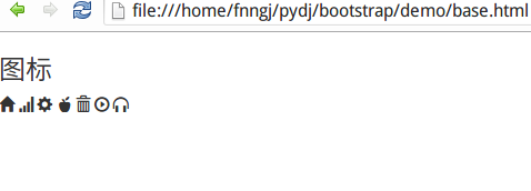
<h3>图标</h3><span class="glyphicon glyphicon-home"></span><span class="glyphicon glyphicon-signal"></span><span class="glyphicon glyphicon-cog"></span><span class="glyphicon glyphicon-apple"></span><span class="glyphicon glyphicon-trash"></span><span class="glyphicon glyphicon-play-circle"></span><span class="glyphicon glyphicon-headphones"></span>
按钮
<button></button>标签用于创建按钮,bootstrap提供了丰富的按钮样式。<h3>按钮</h3><button type="button" class="btn btn-default">按钮</button><button type="button" class="btn btn-primary">primary</button><button type="button" class="btn btn-success">success</button><button type="button" class="btn btn-info">info</button><button type="button" class="btn btn-warning">warning</button><button type="button" class="btn btn-danger">danger</button><h3>按钮尺寸</h3><button type="button" class="btn btn-default">按钮</button><button type="button" class="btn btn-primary btn-lg">primary</button><button type="button" class="btn btn-success btn-sm">success</button><button type="button" class="btn btn-info btn-xs">info</button><h3>把图标显示在按钮里</h3><button type="button" class="btn btn-default"><span class="glyphicon glyphicon-home"></span> 按钮</button>
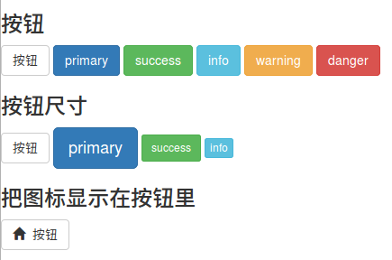
按钮除了有默认的大小外,bootstrap还提供三个参数来调整按钮的大小,分别是:btn-lg、btn-sm和btn-xs。
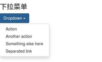
下拉菜单
下拉菜单是最常见的交互之一,bootstrap提供了漂亮的样式。
<h3>下拉菜单</h3><div class="dropdown"> <button class="btn btn-primary dropdown-toggle" type="button" id="dropdownMenu1" data-toggle="dropdown" aria-expanded="true">Dropdown<span class="caret"></span> </button> <ul class="dropdown-menu" role="menu" aria-labelledby="dropdownMenu1"><li role="presentation"><a role="menuitem" tabindex="-1" href="#">Action</a></li><li role="presentation"><a role="menuitem" tabindex="-1" href="#">Another action</a></li><li role="presentation"><a role="menuitem" tabindex="-1" href="#">Something else here</a></li><li role="presentation"><a role="menuitem" tabindex="-1" href="#">Separated link</a></li> </ul></div>
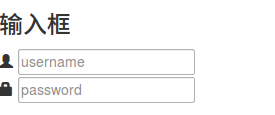
输入框
通过<input></input>标签去创建输入框。
<h3>输入框</h3><div class="input-group"> <span class="glyphicon glyphicon-user"></span> <input type="text" placeholder="username"></div><div class="input-group"> <span class="glyphicon glyphicon-lock"></span> <input type="password" placeholder="password"></div>
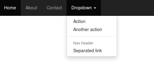
导航栏
导航栏作为整个网站的指引必不可少。
<h3>导航栏</h3><nav class="navbar navbar-inverse navbar-fixed-top"><div id="navbar" class="navbar-collapse collapse"> <ul class="nav navbar-nav"><li class="active"><a href="#">Home</a></li><li><a href="#about">About</a></li><li><a href="#contact">Contact</a></li><li class="dropdown"> <a href="#" class="dropdown-toggle" data-toggle="dropdown" role="button" aria-expanded="false">Dropdown <span class="caret"></span></a> <ul class="dropdown-menu" role="menu"><li><a href="#">Action</a></li><li><a href="#">Another action</a></li><li class="divider"></li><li class="dropdown-header">Nav header</li><li><a href="#">Separated link</a></li> </ul></li> </ul></div><!--/.nav-collapse --> </div></nav>
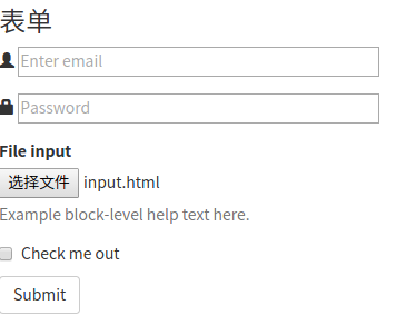
表单
人与系统之间数据的传递都需要依靠表单来完成。比如注册/登录信息的提交,查询条件的提交等。用<form></form>标签来创建表单。
<h3>表单</h3><form><div class="form-group"> <span class="glyphicon glyphicon-user"></span> <input type="email" id="exampleInputEmail1" placeholder="Enter email"></div><div class="form-group"> <span class="glyphicon glyphicon-lock"></span> <input type="password" id="exampleInputPassword1" placeholder="Password"></div><div class="form-group"> <label for="exampleInputFile">File input</label> <input type="file" id="exampleInputFile"> <p class="help-block">Example block-level help text here.</p></div><div class="checkbox"> <label><input type="checkbox"> Check me out </label></div><button type="submit" class="btn btn-default">Submit</button> </form>
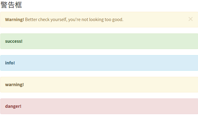
警告框
警告框是系统向用户传达信息和提供指引的重要手段。没有针对警告框的标签,通过bootstrap所提供的样式可以瞬间制作出漂亮的警告框。
<h3>警告框</h3><div class="alert alert-warning alert-dismissible" role="alert"><button type="button" class="close" data-dismiss="alert" aria-label="Close"><span aria-hidden="true">×</span></button><strong>Warning!</strong> Better check yourself, you"re not looking too good.</div><div class="alert alert-success" role="alert"><a href="#" class="alert-link">success!</a></div><div class="alert alert-info" role="alert"><a href="#" class="alert-link">info!</a></div><div class="alert alert-warning" role="alert"><a href="#" class="alert-link">warning!</a></div><div class="alert alert-danger" role="alert"><a href="#" class="alert-link">danger!</a></div>
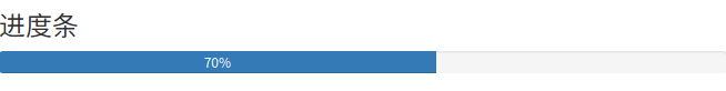
进度条
系统的处理过程往往需要用户等待,进度条可以让用户感知到系统的处理过程,从而增加容忍度。
<h3>进度条</h3><div class="progress"> <div class="progress-bar" role="progressbar" aria-valuenow="70" aria-valuemin="0" aria-valuemax="100" style="width: 60%;">70% </div></div>
以上就是本文的全部内容,希望对大家的学习有所帮助,也希望大家多多支持脚本之家。
如果大家还想深入学习,可以点击这里进行学习,再为大家附两个精彩的专题:Bootstrap学习教程 Bootstrap实战教程