 易网时代-编程资源站
易网时代-编程资源站
易网时代-编程资源站 <!DOCTYPE html><html>....</html>移动设备优先
<meta name=”viewport” content=”width=device-width, initial-scale=1.0”>宽度设置为device-width可以确保它能正确呈现在不同设备上。
<meta name="viewport" content="width=device-width,initial-scale=1.0,maximum-scale=1.0,user-scalable=no">响应式图像
<img src="..." class="img-responsive" alt="响应式图像"> bootstrap.css里设置了img-responsive的属性:.img-responsive {display: inline-block;height: auto;max-width: 100%;}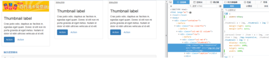
基本的全局显示
body {font-family: "Helvetica Neue", Helvetica, Arial, sans-serif;font-size: 14px;line-height: 1.428571429;color: #333333;background-color: #ffffff;}body {margin:0}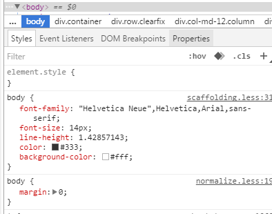
链接样式
a:hover,a:focus {color: #2a6496;text-decoration: underline;}a:focus {outline: thin dotted #333;outline: 5px auto -webkit-focus-ring-color;outline-offset: -2px;} 默认设置有好有坏,难免嘛。a:hover,a:focus {color: #2a6496;text-decoration: underline;}a:focus {outline: thin dotted #333;outline: 5px auto -webkit-focus-ring-color;outline-offset: -2px;}避免跨浏览器的不一致<div class=”container”>..</div>.container的样式:
.container {padding-right: 15px;padding-left: 15px;margin-right: auto;margin-left: auto;} 左右外边距交由浏览器决定。.container:before,.container:after {display: table;content: " ";} 设置display为table,会创建一个匿名的table-cell和一个新的块格式化上下文。:before伪元素防止上边距崩塌,:after伪元素清除浮动。content:” ”修复一些Opera bug。.container:after {clear: both;} 另外还有申请相应的媒体查询:@media (min-width: 768px) {.container {width: 750px; }}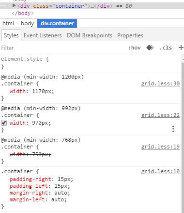
Bootstrap浏览器/设备支持
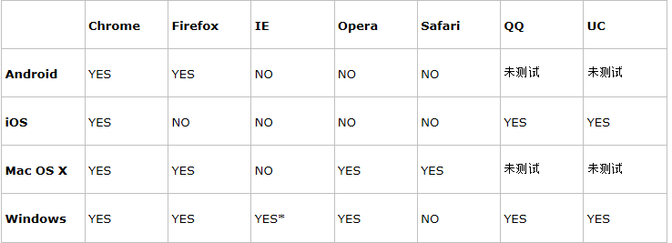
* Bootstrap 支持 Internet Explorer 8 及更高版本的 IE 浏览器。
参考:http://www.runoob.com/bootstrap/bootstrap-css-overview.html
以上所述是小编给大家介绍的BootStrap入门教程(二)之固定的内置样式,希望对大家有所帮助,如果大家有任何疑问请给我留言,小编会及时回复大家的。在此也非常感谢大家对脚本之家网站的支持!