 易网时代-编程资源站
易网时代-编程资源站
易网时代-编程资源站 background-poisition ,最后添加css3动画就可以了,去掉注释,也就仅仅20行的代码。
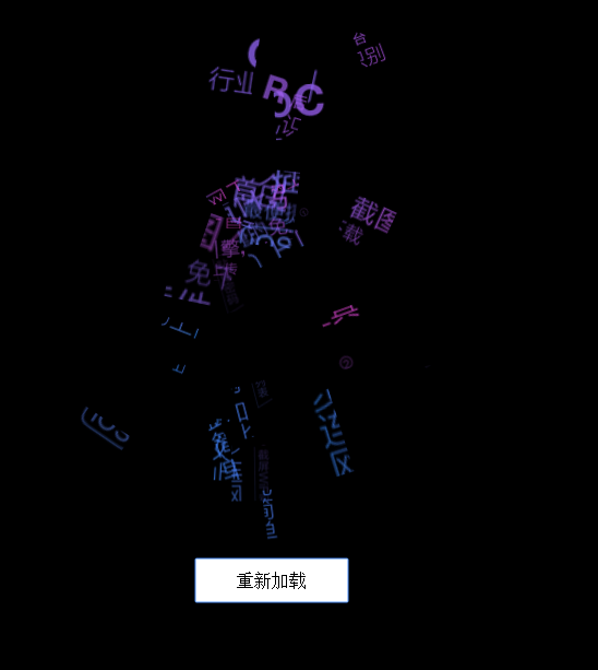
js代码如下:
//c为列数,r为行数,把box划分成多少个小块 var box = document.querySelector(".boxWrap1"),c=4,r=8; //每个小块的宽高 var w = box.offsetWidth/c,h = box.offsetHeight/r; //循环添加小块 for(var i = 0;i < r;i++){for(var j = 0;j < c;j++) { var _div=document.createElement("div"); var _left = j * w,_top = i * h; //添加css样式,并设置每个小块的背景 _div.style.cssText = "width:"+w+"px;height:"+h+"px;left:"+_left+"px;top:"+_top+"px; opacity:0;background-position:"+(-_left) + "px " + (-_top) + "px"; //添加css动画时间 _div.style.transition = "all "+ Random(1,1.8) +"s ease"; //添加css的transform动画 _div.style.transform = "perspective(800px) translate3d("+Random(-200,200)+"px, "+Random(-200,200)+"px,300px) rotate("+Random(-90,90)+"deg) scale("+ Random(0,2) +")" //添加 box.appendChild(_div);}; }; //延时添加动画 setTimeout(function(){box.classList.add("set"); },100); //随机数 function Random(start,end){return Math.random()*(end-start)+start; }; 完整的示例如下:<!DOCTYPE html PUBLIC "-//W3C//DTD XHTML 1.0 Transitional//EN" "http://www.w3.org/TR/xhtml1/DTD/xhtml1-transitional.dtd"><html xmlns="http://www.w3.org/1999/xhtml"><head><meta http-equiv="Content-Type" content="text/html; charset=utf-8" /><title>利用JS实现文字的聚合动画效果</title><style>.boxWrap1{width: 160px;height: 417px;position: relative;margin:0px auto;}.boxWrap1 img{width: 100%;}.boxWrap1 div{background: url(http://itakeo.com/wpimg/2_1.png) no-repeat;background-size: 160px auto; position: absolute; left: 0px;top: 0px;}.boxWrap1.set div{ opacity: 1!important;transform:perspective(800px) translate3d(0px,0px,0px) rotate(0deg) scale(1)!important;-moz-transform:perspective(800px) translate3d(0px,0px,0px) rotate(0deg) scale(1)!important;-webkit-transform:perspective(800px) translate3d(0px,0px,0px) rotate(0deg) scale(1)!important;}.boxSiteWrap{ width: 100%;overflow: hidden;height: auto; background: #000;padding: 140px 0}.boxSiteWrap button{cursor:pointer;display: block;font-size: 16px; width: 140px;height: 40px; background: #fff;color: #000;border:none;margin:30px auto;}</style></head><body><div class="boxSiteWrap"><div class="boxWrap1"></div><button>重新加载</button></div><script>window.addEventListener("load",function(){;(function(){function init(){var box = document.querySelector(".boxWrap1"),c=4,r=8;var w = box.offsetWidth/c,h = box.offsetHeight/r;for(var i=0;i<r;i++){for(var j=0;j<c;j++) { var _div=document.createElement("div"); var _left = j * w,_top = i * h;_div.style.cssText = "width:"+w+"px;height:"+h+"px;left:"+_left+"px;top:"+_top+"px; opacity:0;background-position:"+(-_left) + "px " + (-_top) + "px";_div.style.transition = _div.style.MozTransition = _div.style.WebkitTransition = "all "+ Random(1,1.8) +"s ease";_div.style.transform = _div.style.MozTransform = _div.style.WebkitTransform = "perspective(800px) translate3d("+Random(-200,200)+"px, "+Random(-200,200)+"px,300px) rotate("+Random(-90,90)+"deg) scale("+ Random(0,2) +")"box.appendChild(_div);};};setTimeout(function(){box.classList.add("set")},100);function Random(start,end){return Math.random()*(end-start)+start; };};init();var flag = true;document.querySelector("button").onclick = function(){if(flag){document.querySelector(".boxWrap1").classList.remove("set")setTimeout(function(){document.querySelector(".boxWrap1").innerHTML = "";init();flag = true;},1200);flag = false;};};})();});</script></body></html>总结